Tuesday, 28 January 2014

Clockwork Comic, Tattoo Catalogue and Octo design in Context

Although I've set off for this to be a submission for the offlife comic competition, if it doesn't get selected my plan is to make a front and back cover and some pattern pages, I'd like it to be a decent 12 page zine to take to ideally try to get into a few shops. I've had an idea as to what kind of place it would be suitable for, and I'm hoping the style of the comic will appeal to a wide range of ages. In terms of where it should be housed I would love the opportunity to talk to the No Guts No Glory guys to see if they'd be interested in featuring my work. Also alongside with the taxidermy/Steampunk fascinators I make it would be a great idea to maybe take it to alternative/steampunk craft/clothing fairs, people are always trying to find unique goodies there, and it's a great way to network with the type of people that would be interested in my work.

This would be an amazing event to aspire to get to one day!
http://www.alt-fest.com/2014/steampunk-experience

other alternative events like this (below) will also benefit my tattoo zine, it's the type of place where people want to get ideas for tattoos, the alternative world admires the beauty of tattoo designs and maybe a little booklet for a fiver would be better than committing to a tattoo too soon! [=
http://thealternativeandburlesquefair.com/

Also in Bristol where I'm from Gloucester Road has a whole host of individual businesses, some of which would be really happy to feature local artists work. Iota is a shop who seeks alternative art prints/booklets to sell instore amongst their vintage/quirky gifts, the tattoo zine would work really well here, I know they already have a few things like traditional tattoo wrapping paper. Also various cafe's and galleries there are so many places to ask in Bristol they're really friendly and keen to help people out especially on gloucester road,

In terms of agencies, these two outcomes have been quite different. However I do feel like I'm developing two strong styles. One being the more 2D digital outcomes, and the other being the more traditional tattoo designs using colour pencils, I think my love at the moment are the tattoo designs, as that's an aspect of illustration I'd really like to look into, having spoken to various tattoo artists already it's a good place to start practicing my ideas. I hope this translates well with illustration agencies, I know that phillip harris retrained as a tattoo artist but that was after he'd been in the industry for a while so managed to develop an amazing style, I really aspire to be a great illustrator like him - I know tattoos are a part of the western culture a lot more, so I hope this style can start fitting in to more mainstream and commercial style illustrations/collumns etc.

I feel as though http://www.lemonadeillustration.com/ fits in with my more quirkier style. They seem to have a nice variation of illustrators, a few of which I think my style can apply to. The digital side I think works well alongside these illustrators, funnily enough one has done an octopus drawing!

 http://www.lemonadeillustration.com/work/?page=1&artist=208&name=Milli-Jane&cat=1&id=121

Milli-Jane  Illustration -
http://www.lemonadeillustration.com/work/?page=1&artist=323&name=Giulia_rivolta_&cat=1&id=148
Giulia Rivolta Illustration -
and the more pencilled designs:
http://www.lemonadeillustration.com/work/?page=1&artist=215&name=Mercedes_deBellard&cat=1&id=125
Mercedes  deBellard Illustration -
http://www.lemonadeillustration.com/work/?page=1&artist=61&name=Carole_Wilmet&cat=1&id=58
Carole Wilmet Illustration -
This agency seems quite good for a more story-children friendly artwork, maybe for the clockwork zine
http://www.sylviepoggio.com/

I like the style of this agency, there seems to be a good varied collection of artists, varying with different practices, I can see where I could potentially fits in here,
http://www.goodillustration.com/
really love these two artists:
http://www.goodillustration.com/portfolio/Andrew-Fairclough-177/
picture 4122
and http://www.goodillustration.com/portfolio/Phil-Wheeler-31/
he seems a really good mix of styles, I love the pattern, the symmetry, the animal and the fact it looks painted but is digitally done (I think!)

 picture 3479


And finally it's always good to aspire to be with the big guns!!! Once I've developed my style more and settled on something I think I'd be more confident to try and submit work to them. The Central Illustration Agency!
Adore this work! I can see how I could try and adapt my work to make it more commerical and accessabile for others, this is a perfect example of a beautiful pattern design, maybe that's something I should try more ofhttp://www.centralillustration.com/illustrators/ray-smith


Saturday, 25 January 2014

Tattoo Catalogue In Context

The reasoning behind why I'm creating this little booklet! Over the past few years I've been really into tattoo art, and it's a path I'd really like to go down on in the future, having spoken to various tattoo artists, practicing designs and placements of where designs might be is a great place to start. They suggested getting a profile on big tattoo planet, it gives updates on which studios need apprentices etc. It's a great showcasing paltform to show off your work. My aim is to fill up my big sketchbook with tattoo designs and I thought by making this zine it'll be a nice promotional way to show off some of my best designs to the tattoo artists. My aim is if the zine sells well at Stuff fair etc. I might re order some more to take round to various tattoo studios around Plymouth and Bristol, I really enjoy going round and chatting to people in the local area, at local businesses. Which in turn might be a great platoform for seeking out apprenticeships! I know some studios prefer phonecalls first but majority of the tattoo studios are quite laid back and don't mind enthusiastic students saying hello!

My plan is to get abuot 8-10 designs to feature in my little tattoo catalogue.

Some Studios:

Dust'n'Bones - Plymouth
Sailors Grave - Plymouth
Art and Soul Tattoo - Plymouth
Attica - Plymouth
Holey Skin (Angels) - Bristol (Georgia)
The Tattoo Studio - Bristol (Ben Boston)
Purple Rose - Bristol
Pierced Up - Bristol

Reference Images

When I create my tattoo designs I always end up have a central focus point e.g. animal head and creating flowering patterns/symmetrical organic patterns around it, so I've collected some imagery I think will help develop my designs. Various photos of flower tattoos and photographs of various animals I'd like to try and draw and incorporate into my designs [=


Illustrator Turned Tattoo Artist

My tutor caroline forwarded me some information about an illustrator friend who now designs and does tattoos for people, Lucy Browns
 work is so beautiful, mainly incorporating detailed dotted work, I especially love her more organice work, with flowers and beautiful leafy swirls, here are some examples. All of these exmaples have been taken from Lucy Browns Facebook page, Enjoy as much as I did!


Zine Examples and Tattoo Booklet

Looking at examples of zines predominately zines focusing on promotional work or individual pieces of artwork in booklets.

One of my absoloute favourite illustrators Phillip Harris I own a couple of his zines it's good to know even a really established illustrator can have affordable pieces of art for people and that's what I like about the zine 'culture'. It's also good to compare the prices of zines so I can think about what to sell mine for.

Phillips Harris: This is a 12 page black and white zine Harris sells for £5


These further two examples of his comic and zines are currently on sale, but for the 8 page comic it's on sell for £4 and the 26 page comic an illustrated alphabet in a world run by animals for £6!


Rob Hunters the new ghost, although this is a comic, it is just such a beautiful story and set of illustrations it's worth showing in my research!!!


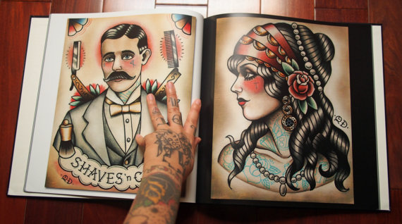
I found this beautiful tattoo catalogue, has some amazing traditional designs throughout it, love the finish, I think it's something I'd like to achieve for my later projects and tattoo design endeavors, I'd like to find out how these designs are finished off/done... Here's some of the iamges from the book, in comparison to a zine it comes in at £80!!! Quyen Dinh Tattoo Flash Book, 2012 Collection


Tattoo Catalogue

For my final project I'm going to be making a mini zine/tattoo catalogue with my tattoo designs in it. My designs always centre around 'organic' designs or fairly traditional style coloured tattoos with organic flowers/leaves decoration centred around the main design etc.

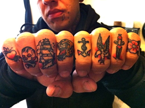
Initial research - inpirational tattoo designs [=


Wednesday, 15 January 2014

Victorian Signs

I've collected various images of different signs, mainly relating to victorian cast iron and brass signs. Whilst trying to think of colour swatches for some of the text I'll have in my comic I thought of the traditional litter bins black with gold writing, so I researched into more writing and liked some of the more simpler victorian typography. As I want the colours in the comic to be a bit duller I think the gold will stand out if there is speech or a sign in the comic etc.


Victorian Clothes

Reference images for Victorian Clothes, I don't want the focus to look like it's a childs workhouse I want it to be more like a school so these images may not be the reflection or direction I want to go with for my story, but it gives an accurate historical account of the style of clothing the children may have worn, this ranges from poorer children to the wealthy.


Victorian Slides

I came across these lovely Victorian Slides from an Antique shop recently and I thought they were really beautiful! The fact that they're a simple series of images or just one image telling a story is really helpful for the work I'm doing, it's so important to be able to convey the story and in this case in very few images, a lot of these stories seem quite simplified, so I think that's what I need to do when finalising mine.

What I found interesting was through my research of victorian/steampunk styled artwork is that it's all very sepia/black and white imagery, but with these antique slides they're very colourful and some the simplified style I'd like to do. A fantastic resource for me to use love how some of the images are in circles too, really lovely idea, might keep that 'pocket-watch' or clock shape quality to some of my images/final outcomes.